Understanding Statistical Tools and Techniques
PARETO CHART
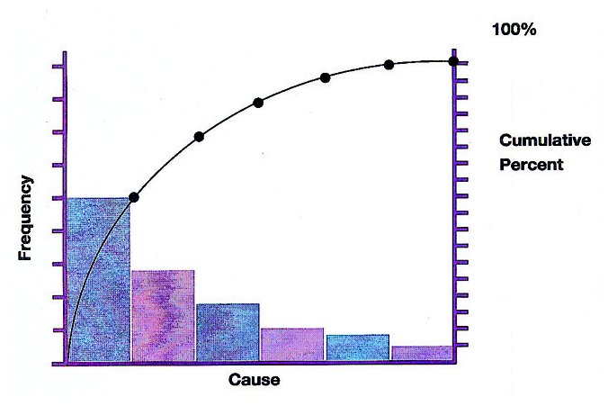
A pareto chart looks like a bar graph, but it contains both bars and a line graph. It is one of the basic tools of quality control. The length of the bars in the graph represents frequency or cost (time or money). These bars are arranged with longest bar on the left and shortest to the right. This is a tool which can be used to analyze the ideas from brainstorming session. This tool is also known as Pareto diagram or Pareto analysis. This tool is used to identify the vital few problems or causes of problems that have the greatest impact on the process. This chart pictorially represents data in the form of a ranked bar chart that shows the frequency of occurrence of items in descending order. The Pareto chart is named after Wilfried Fritz Pareto, an Italian engineer, sociologist, economist, political scientist and philosopher. He introduced the concept of Pareto efficiency.
It is significant to use Pareto chart:
- To analyze data about frequency of problems or causes of problems in a process
- To focus on the most significant problem or cause, when there are many problems or causes
- To analyze broad causes
- To communicate with others about the data
Following procedure will be useful to use Pareto chart and its analysis:
- Decide the categories of group items
- Decide approximate measurement (frequency, quantity, cost, or time)
- Decide the time period to gather data and use in the Pareto chart (one work cycle, one full day, or one week)
- Collect data, record and assemble data for the category each time
- Subtotal the measurements for each category
- Determine the appropriate scale for the measurements data collected
- Mark the scale on the left side of the chart
- Construct and label bars for each category by placing the tallest to the left, next tallest to its right and so on
- Calculate the percentage for each category
- Draw a right vertical axis and label it with percentage in a graph paper. Be sure that left measurement corresponds to one-half and it should be exactly opposite 50% on the right scale.
- Calculate and draw cumulative sums
- Add the subtotals for the first category and second category and place a dot above the second bar indicating the sum, then add subtotal of third category to the sum and place a dot above the third bar indicating the new sum and so on. Continue the adding subtotals and placing dots for all bars.
- Connect the dots, starting from the top of first bar. The last dot should reach 100 percent on the right side
In this way we can visualize the most important factors among a typically large set of factors through the Pareto chart. A Pareto chart often represents the most common sources of defects, the highest occurring type of defect, or the most frequent reasons for problems.
How you liked the write-up. Please post your comments. Thanks.
No comments:
Post a Comment